The Product Design Trifecta: How to Design Products People Love (Functional, Aesthetical & Delightful)

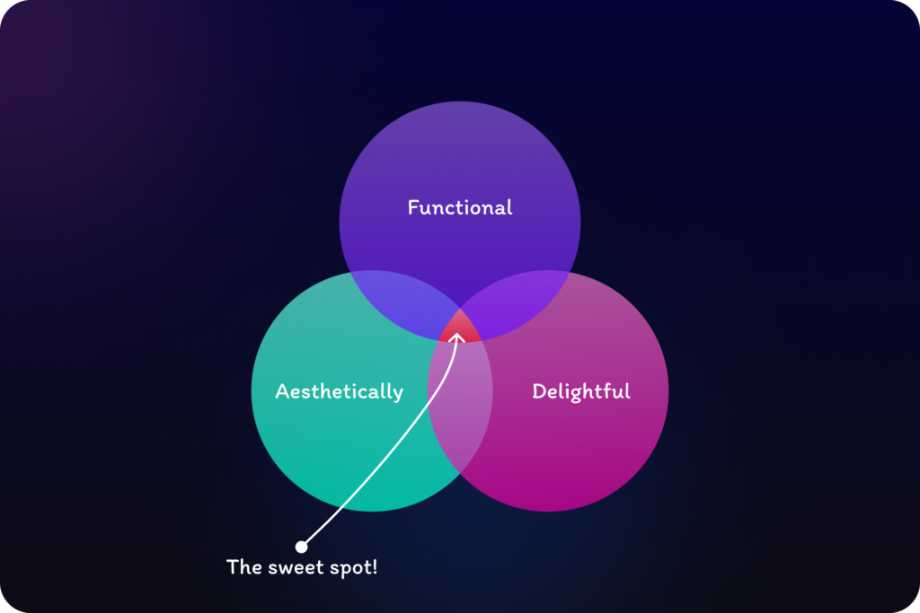
Design isn’t just about making products functional or look pretty, or just delightful. It’s about creating experiences that are functional, aesthetically pleasing, and ultimately delightful. This trifecta should be the guiding light for every designer, especially in the ever-evolving world of product experiences.
The Foundation: Functionality First
Functionality is the bedrock of good design. It’s about solving user problems with clarity and efficiency. A website that takes ages to load or an app with confusing navigation is a recipe for user frustration, no matter how beautiful it looks.
Here is an example:
Imagine: You open your fitness app, eager to track your progress. But instead of being greeted with a clear overview of your steps, heart rate, and sleep, you’re faced with three separate cards. Each card requires a tap, adding an unnecessary step and breaking the flow of your experience. It feels like work to simply check your basic stats.
Now imagine this: You open the app and instantly see all your key metrics displayed prominently on the home screen. Your daily steps, current heart rate, and sleep duration are presented clearly and concisely. This instant access to information creates a sense of control and satisfaction. If you want to dive deeper, each metric becomes a doorway to detailed breakdowns, accessible with a single tap. This design feels intuitive and effortless, aligning with your desire to quickly understand your health and fitness progress.
The Polish: Aesthetics Matter
Aesthetics are not just about making things look good, they’re about making them feel good. Once your design’s foundation is laid with solid functionality, it’s time to craft a visual language that resonates with your users and reinforces your brand identity. Forget trendy fads and focus on cohesiveness, clarity, and emotional impact.
Think beyond the pixels:
- Color Palette: Colors evoke emotions! Choose a palette that aligns with your brand’s personality and resonates with your target audience. Think calming blues and greens for a financial app, or bright, playful tones for a children’s game. (Like we made BYJU’s app bright and playful for school-going students)
- Typography: Clarity is king. Select fonts that are readable across devices and screen sizes, ensuring your message shines through without strain.
- Iconography: Icons are mini ambassadors! Keep them clean, consistent, and readily comprehensible. Each icon should tell a clear story at a glance.
- Illustration: Don’t underestimate the power of pictures! Use illustrations to spark emotions, support your brand identity, and engage your audience. Remember, they should be consistent with the overall tone and message.
- Patterns: Subtlety is key. Patterns can add visual interest without overwhelming the user. Use them sparingly and ensure they complement your overall design aesthetic.
Remember, aesthetics are a powerful tool to:
- Build trust and credibility: A professional and polished design fosters user confidence.
- Enhance brand recognition: A consistent visual language reinforces your brand identity and makes you memorable.
- Create emotional connections: The right design can evoke positive emotions, making your users feel comfortable and engaged.
By going beyond the surface and understanding the emotional impact of aesthetics, you can create interfaces that are not only beautiful but also deeply resonate with your users.
The Secret Sauce: Delightful Surprises
Finally, there’s the cherry on top: delight. Remember the first time you stumbled upon a hidden level in a game? Or received a personalized birthday greeting from your favorite app? Delight is that unexpected sprinkle of joy that elevates a good experience to an unforgettable one. It’s about going beyond the expected and leaving users with a smile.
Here’s how to sprinkle in some delightful surprises:
- Micro-interactions: Make simple actions feel special with subtle animations or sounds that acknowledge user input. It’s like a virtual high-five for their engagement.
- Personalized touches: Craft experiences that feel unique and tailored to the individual. A birthday greeting or a recommendation based on their past choices shows you care.
But remember, delight is a fleeting experience. What’s surprising today becomes expected tomorrow. Just like free Wi-Fi in hotels went from a delightful surprise to a basic necessity, so will other delights. Now having access to premium wifi internet on a flight is a delight but it will soon become a free standard offering and then it will be a basic expectation for the flyers. The key is to constantly iterate and innovate, introducing new surprises to keep users engaged and coming back for more.
Think of it like a chef who keeps surprising their guests with new flavour combinations. Don’t get stuck in a rut of the same old “delightful” features. Experiment, be playful, and keep your audience guessing (in a good way!).
Here are some examples of how this can translate to different domains:
- E-commerce app: Surprise users with a free sample relevant to their recent purchase.
- Fitness app: Offer bonus points for completing a surprise workout challenge.
- Productivity app: Hide a mini-game to help users take a break and refresh their minds.
As designers, we need to constantly push the boundaries and introduce new “delightful” moments to keep our users coming back for more.
By striving for this trifecta of function, aesthetics, and delight, you can create UX experiences that are not only usable but also memorable and engaging. So, go forth, design with purpose, and remember, the best designs are often the ones that leave users saying, “Wow, I didn’t expect that!”
Want to learn more about this topic?
Book a 15 mins session with me to connect over this topic.
Project brewing? Let's connect!


